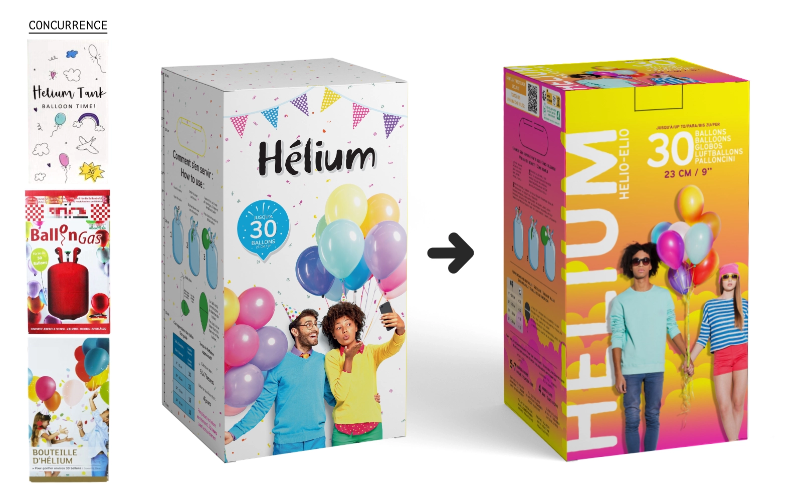
Challenge
The festive products company wanted to modernize the image of its flagship product because helium cylinders were losing shelf visibility against aggressive competitors. The old identity (white dominant) lacked impact, dynamism and fun.
Mandate : Modernize the brand image to send a strong message ("Look at Us!") while ensuring coherence across the range.
Strategy
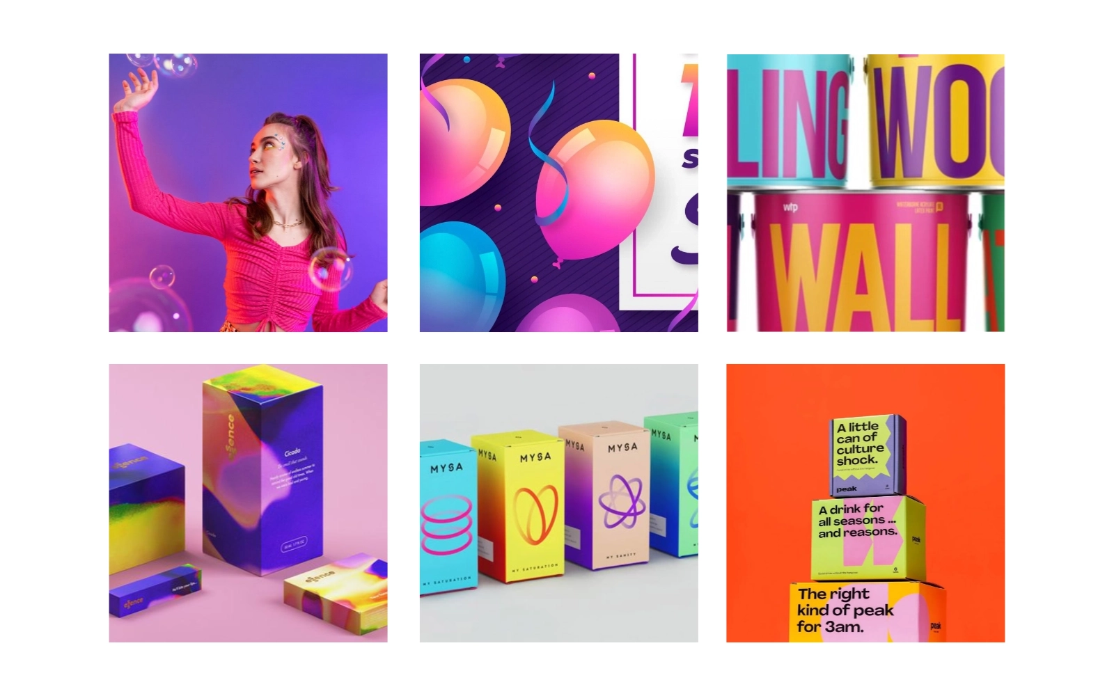
"Colors and more Colors". Contrary to sector codes, I opted for a visual saturation strategy.
Creation of a flexible visual system capable of adapting to multiple references without losing identity.
Technical Challenges
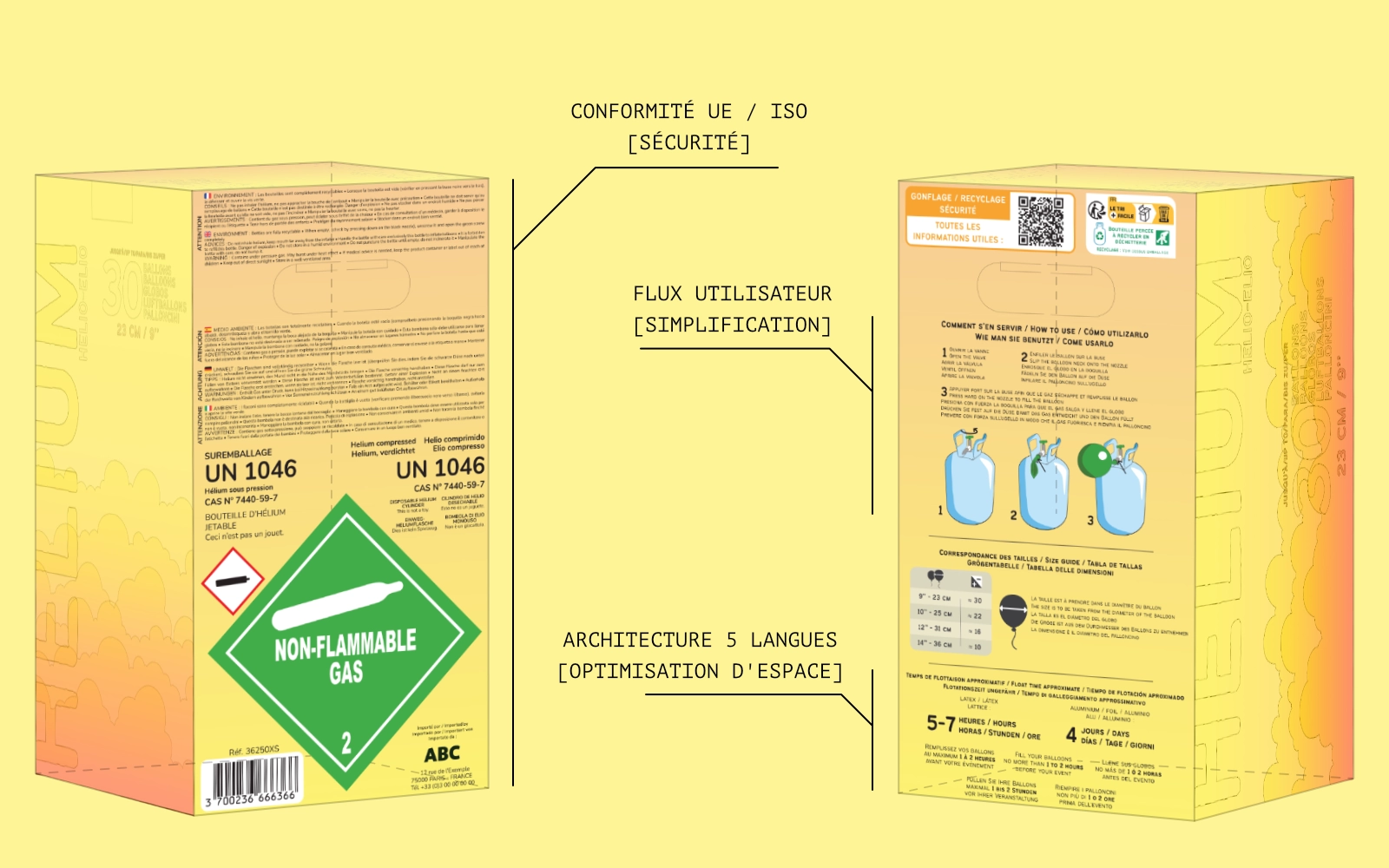
The complexity of the project lay not only in graphic creation but in its strict industrial deployment for the European market.
- Multilingual Management & Compliance : The packaging had to integrate user manuals and strict safety standards in 5 languages, all on a constrained printable surface.
- The UX/Print Solution: I had to design millimetric information architecture (typographic density, visual hierarchy) to make these 5 languages coexist legibly, without ever sacrificing aesthetic impact.
- International Quality Control : Close collaboration with Asian suppliers was necessary to ensure rendering fidelity. I had to proceed with precise colorimetric adjustments and ensure the final product perfectly matched the validated visual system.
Results & Impact
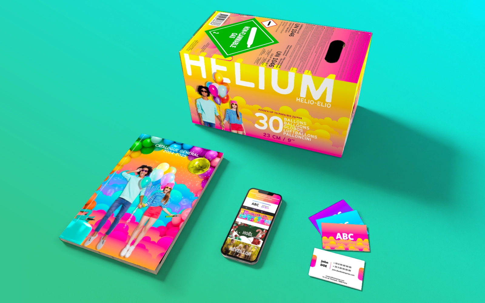
What started as packaging became the company's global identity (Website, email campaigns, business cards...).
A design that catches the eye, truly stands out, and modernizes the product image.
The identity was immediately adopted by sales teams as a sales lever.