Context & role
challenge
Research & Strategy
Creative Concept
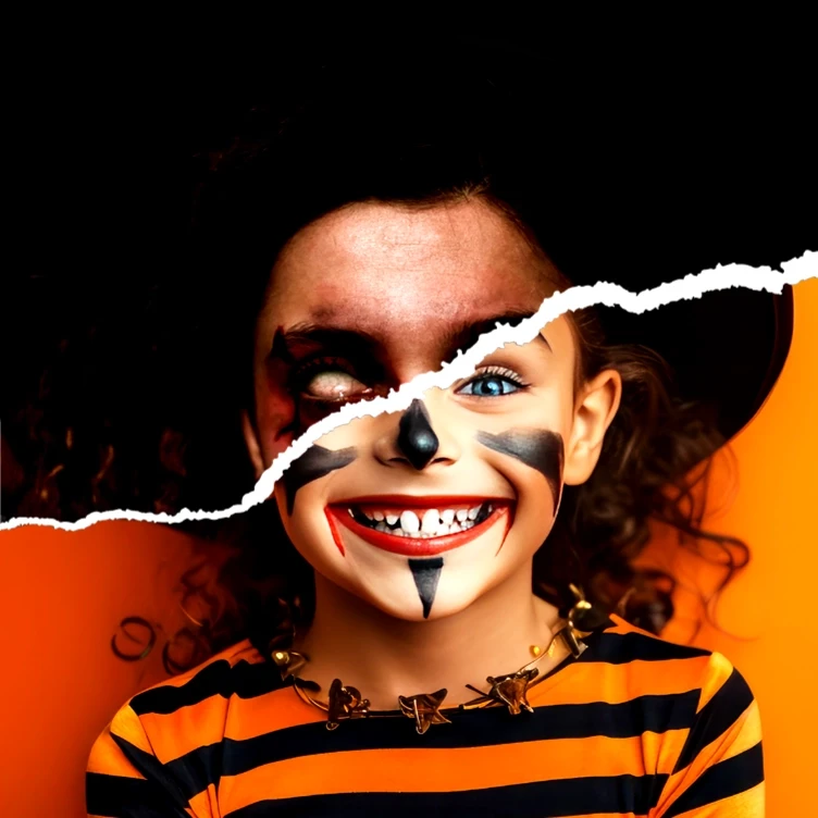
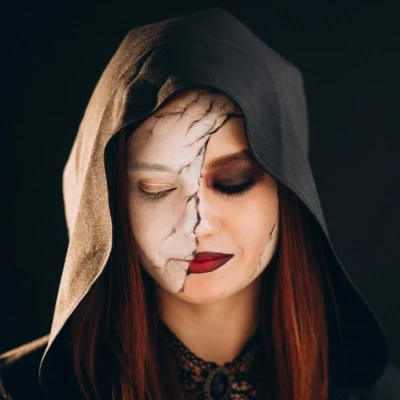
The core visual concept was based on a "dual personality" theme:
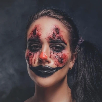
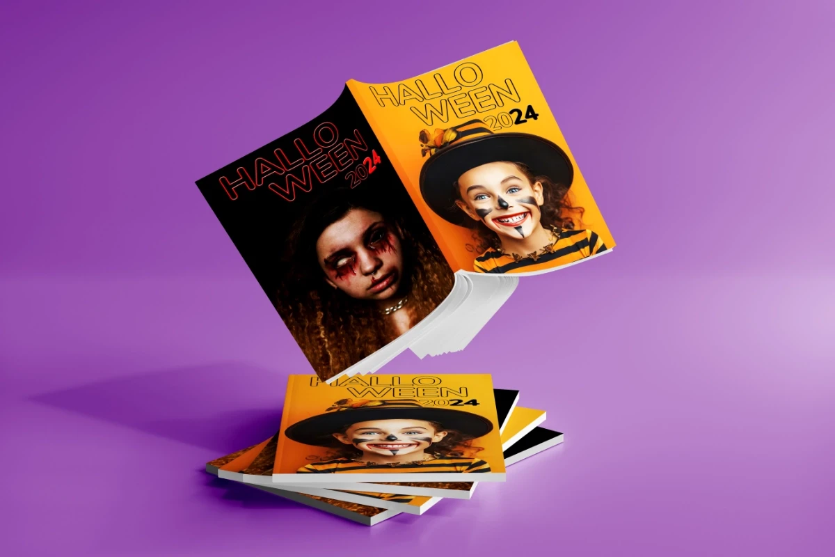
A young girl in a cute witch costume with a torn-paper reveal to her darker, bloodier alter ego.
This duality (good vs. evil) became the anchor for:
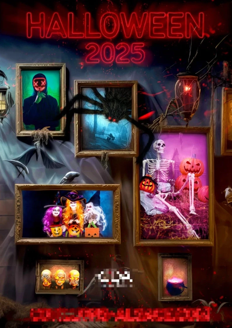
Catalog cover design
Color palette choices: orange & black for collaterals, purple accents for packaging
Visual storytelling across print, flipbook, showroom and packaging
Multi-Channel Execution
Printed Catalog
Main sales tool
Designed to guide buyers through categories and novelty items
Featured the teen character throughout to establish thematic continuity
Animated Online Flipbook
Built using Flipsnack
Embedded videos to spotlight key items and animated GIfs for entertainment
Layout pacing considered UX principles: motion to draw attention, but restful pages to avoid overwhelm

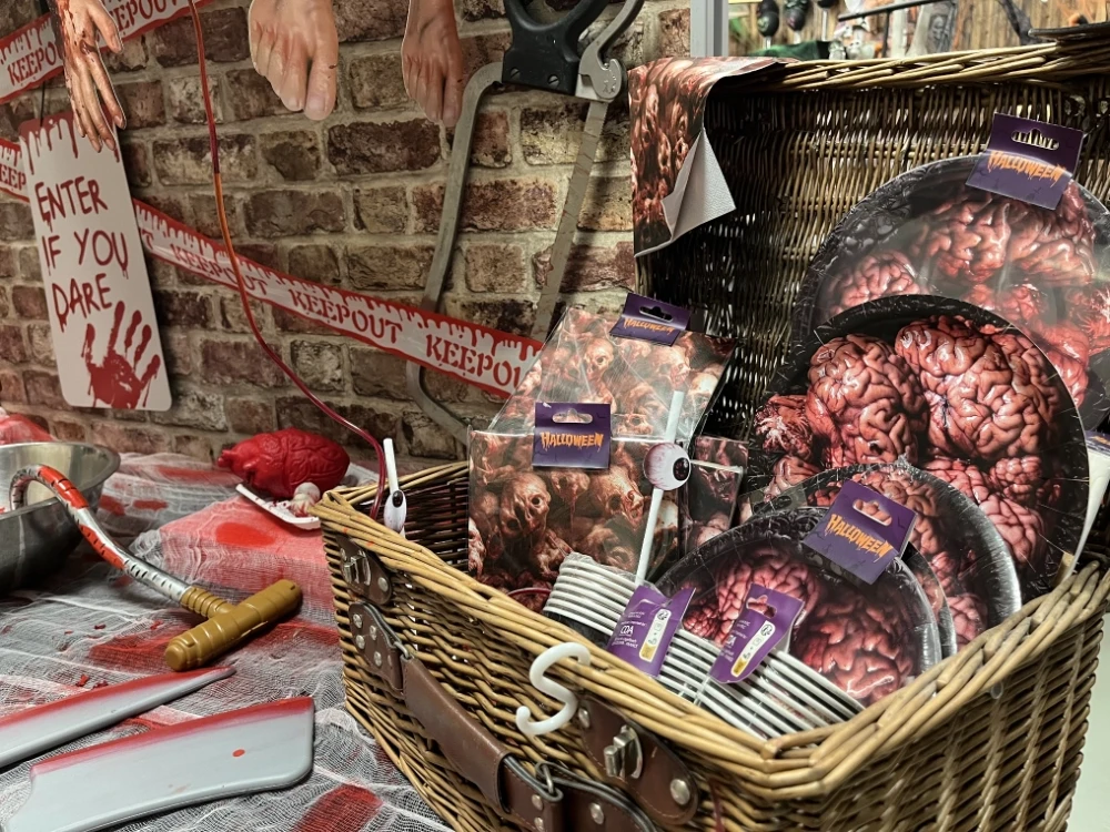
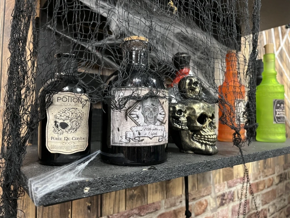
Packaging
Adapted supplier dielines for better efficiency
Designed labels for items like vials, plates, and accessories
Prioritized legibility, visual cohesion and shelf appeal
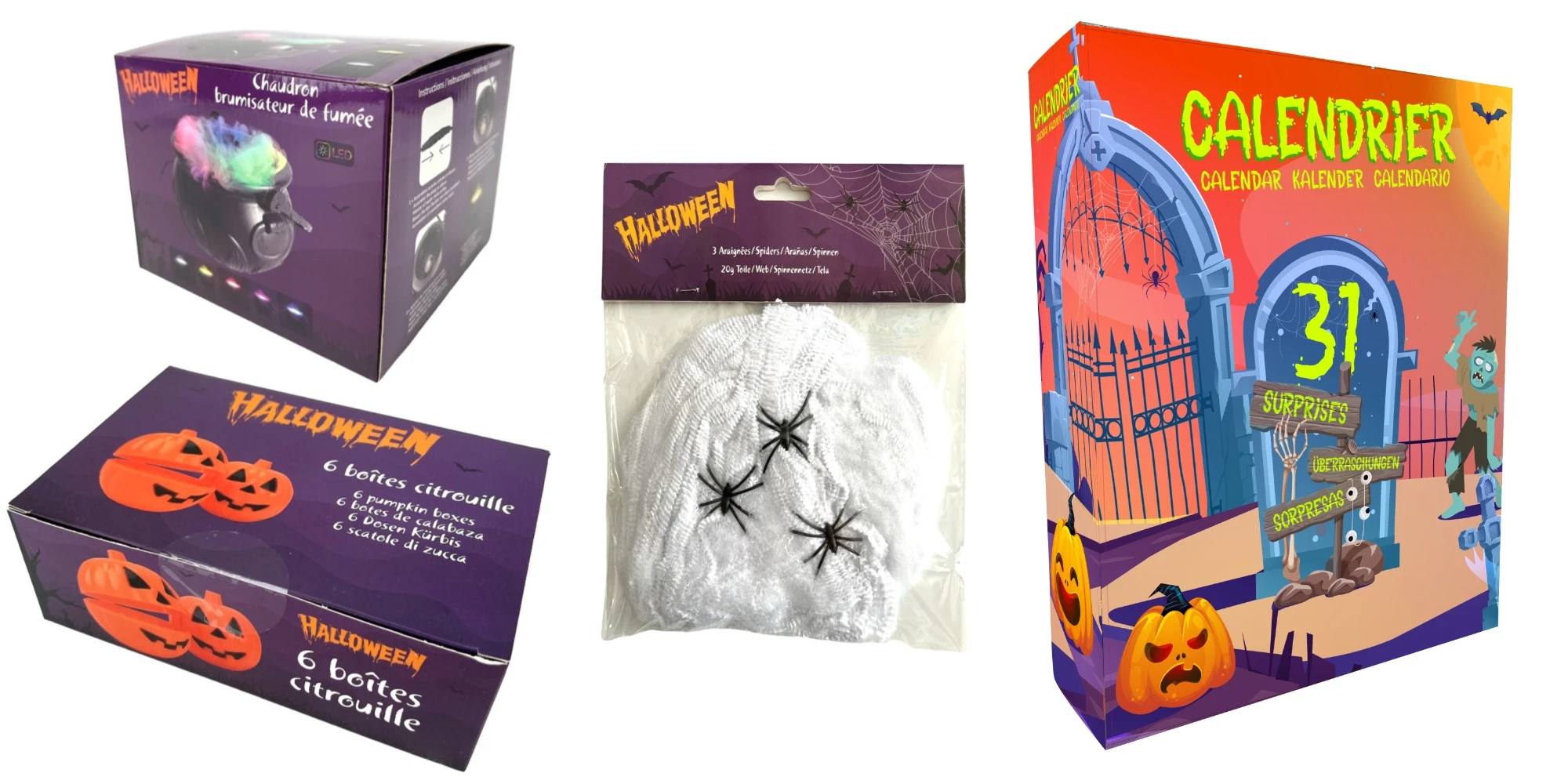
Promo Materials
Large showroom poster (100 x 140 cm)
Flyers and website banners with seasonal CTAs and QR codes
Included a creative packaging box with catalog, item samples, candies and goodies sent to VIP clients

Results & Reflections
results
All packaging delivered to suppliers in time for Halloween release
Flipbook enhanced the digital offering compared to previous seasons
Received positive informal feedback from buyers and internal teams
Learnings
Seamless cross-media storytelling amplifies the impact of each touchpoint
Even in price-driven markets, design can create delight and anticipation
Modern tools make motion-enhanced catalogs easier to produce than expected
What I would Improve
With more resources, I would have:
Connected the flipbook directly to our e-commerce platform for an integrated shopping experience
Added trackable metrics for performance insights