Context & Objectives
The company wanted to modernize its image, differentiate from competitors and embrace a more dynamic, fun and contemporary communication approach.
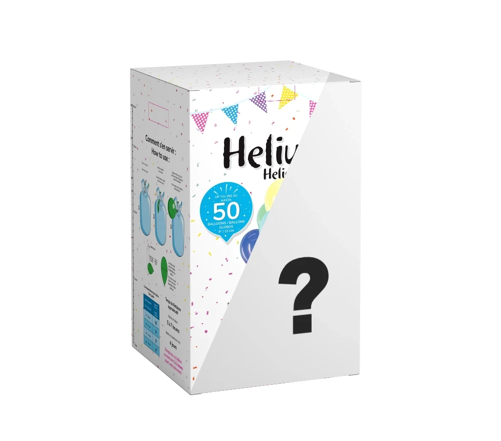
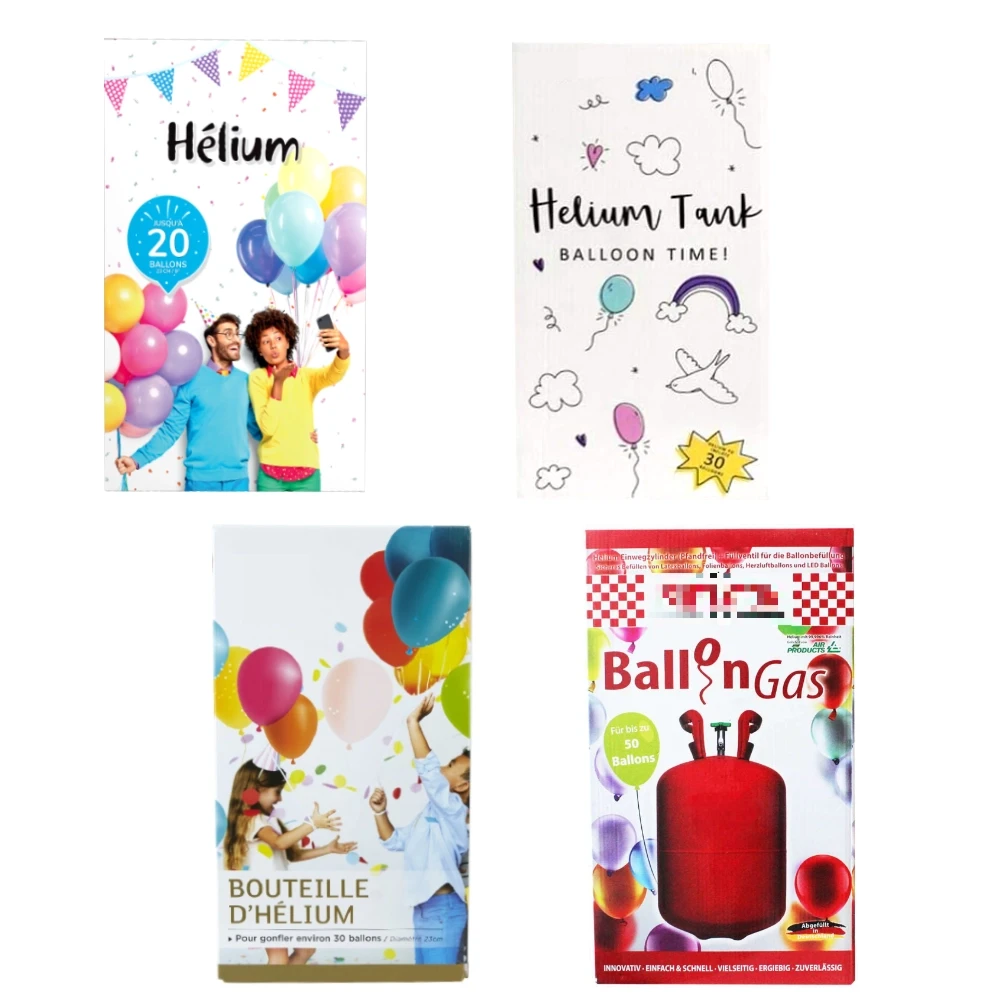
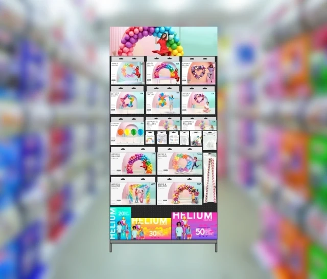
The old white-dominated designs lacked impact and shelf visibility.
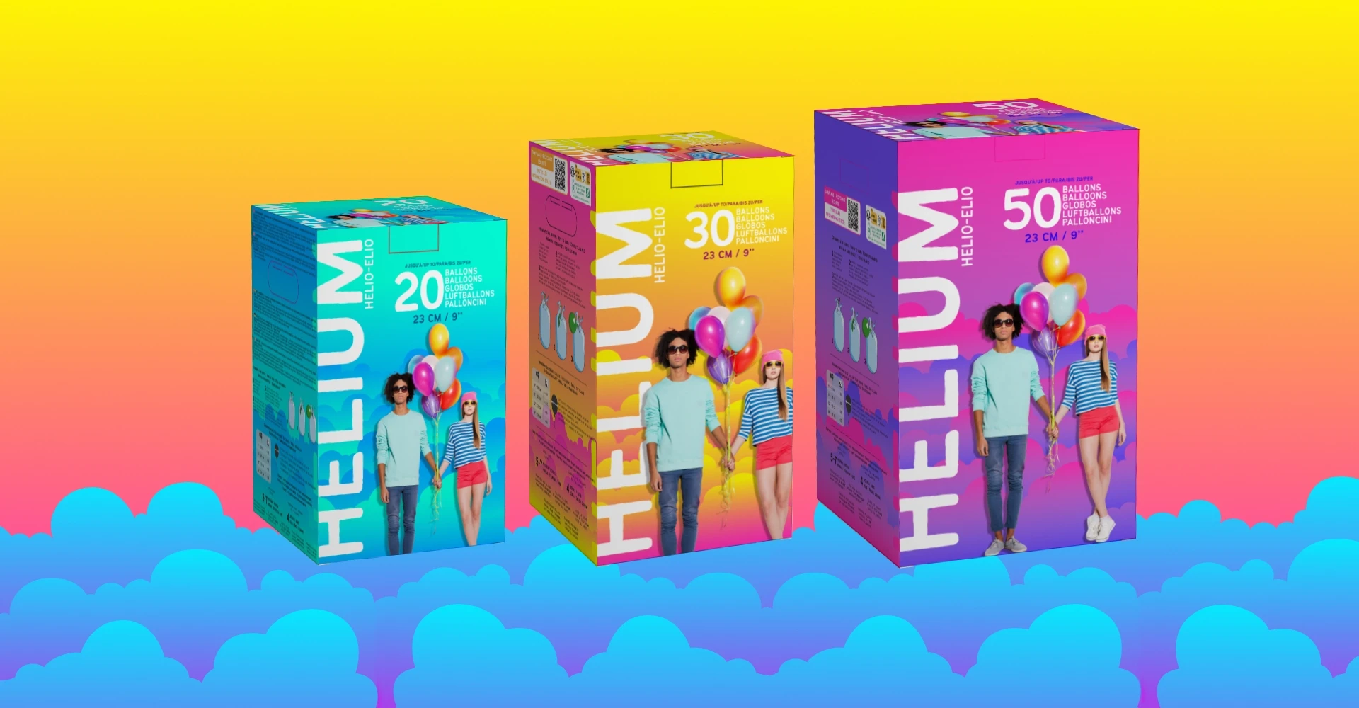
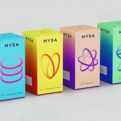
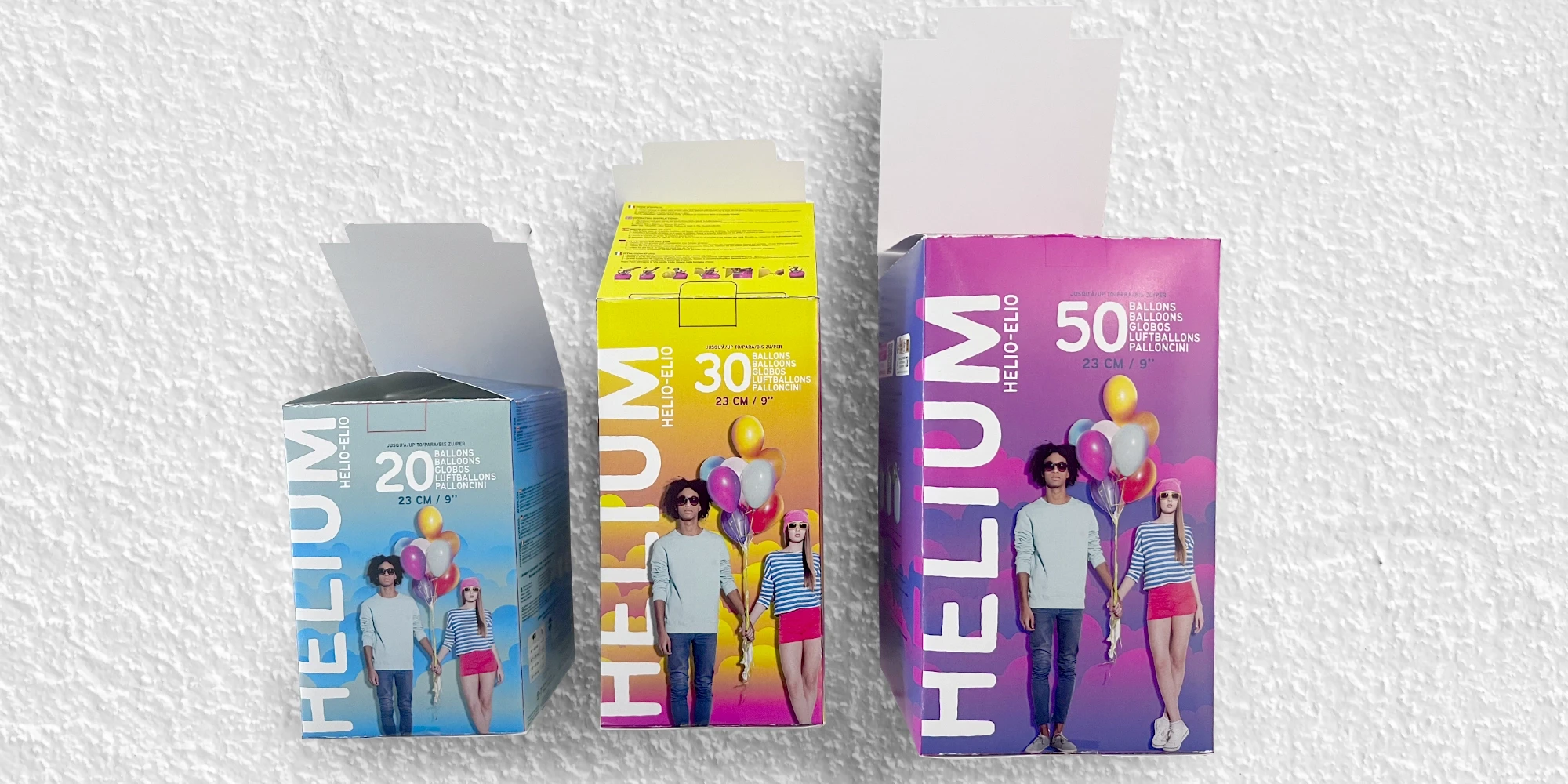
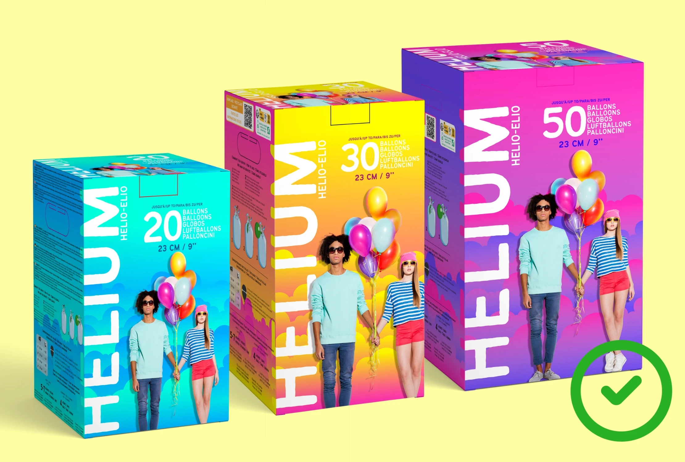
CHALLENGE: Create a bold, colorful and distinctive design.
Problem Analysis
• Lack of visual impact
• Too similar to competitors
• Struggled to grab buyers' attention


visual strategy
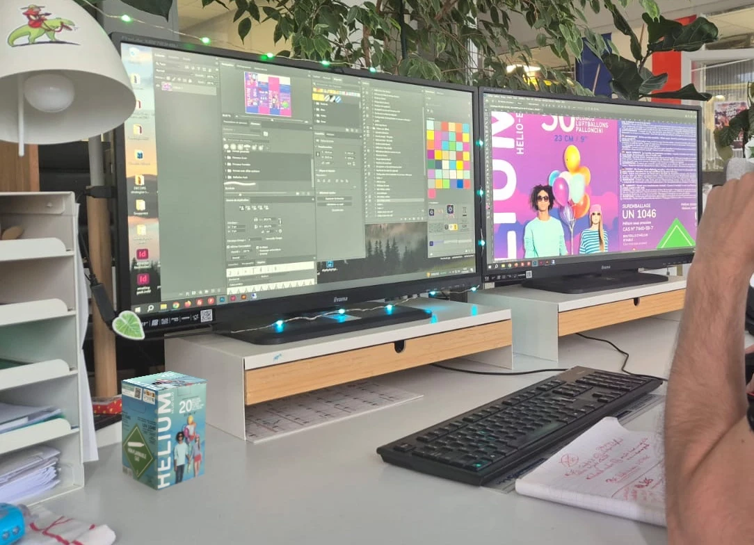
creative process
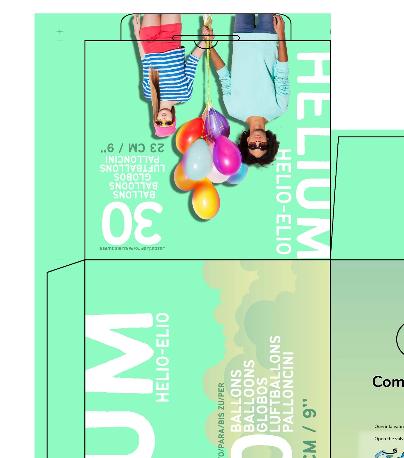
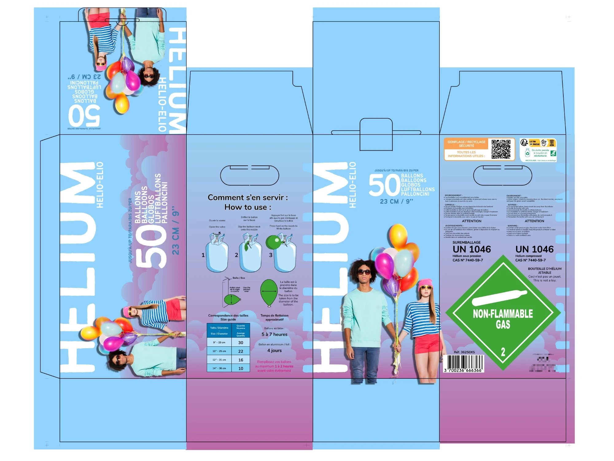
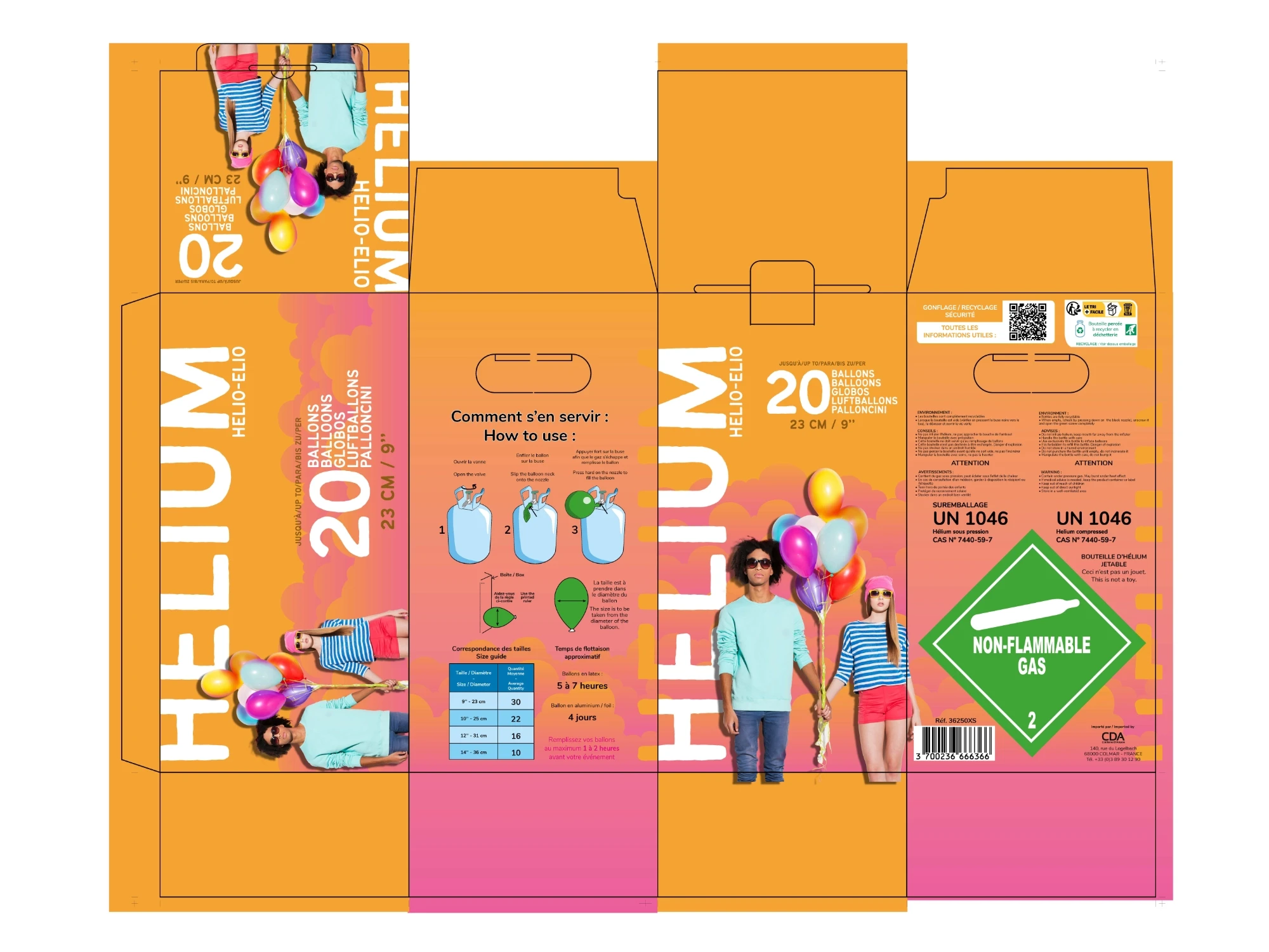

Technical constraints
All legal disclaimers and product texts had to meet official regulatory standards before going to market
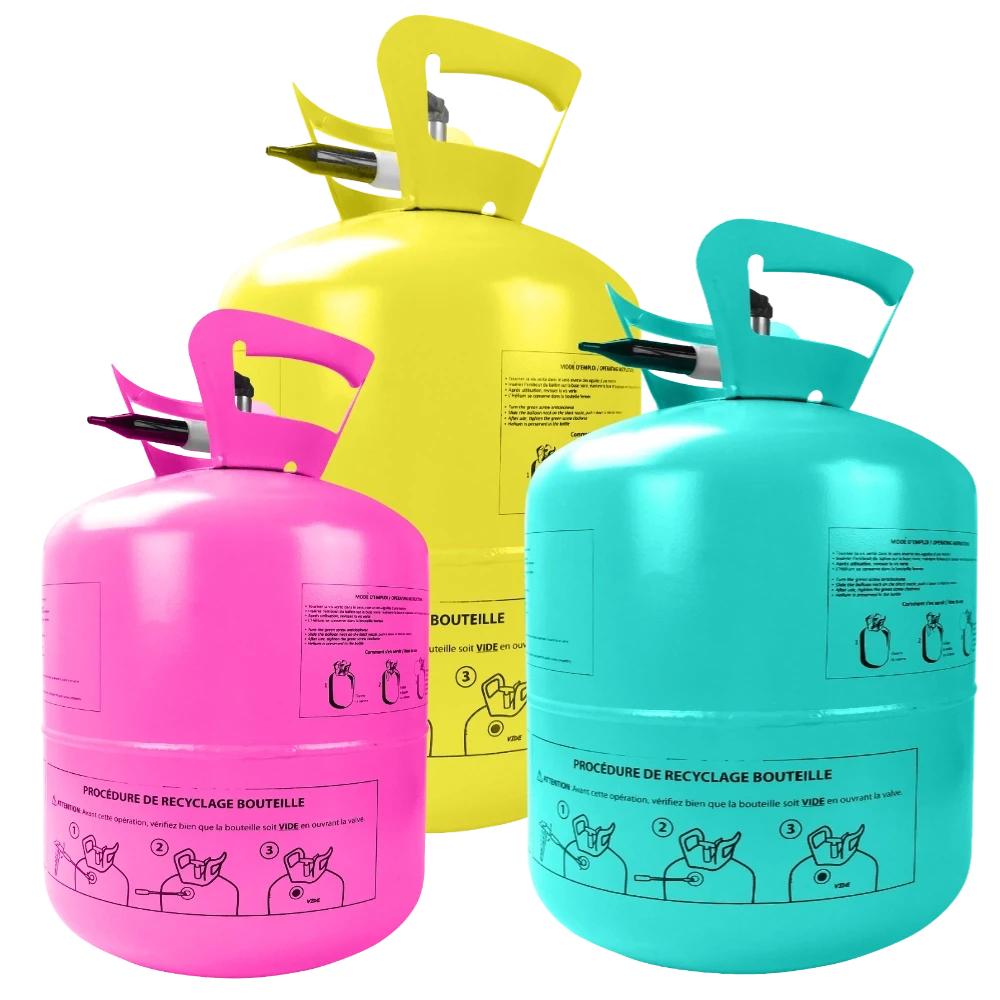
Gradient adaptation to one-color steel printing (Pantone conversion)
Color level adjustments for cardboard packaging based on feedback from Asian suppliers
Impact & Results
"A design that catches the eye, truly stands out and modernizes the product’s image."
The team was blown away by the results and buyers praised the creativity and how fast I was able to deliver those 3 complete packaging visuals.
Measuring the commercial outcome was challenging, as purchasing decisions in this market are largely influenced by pricing rather than design.
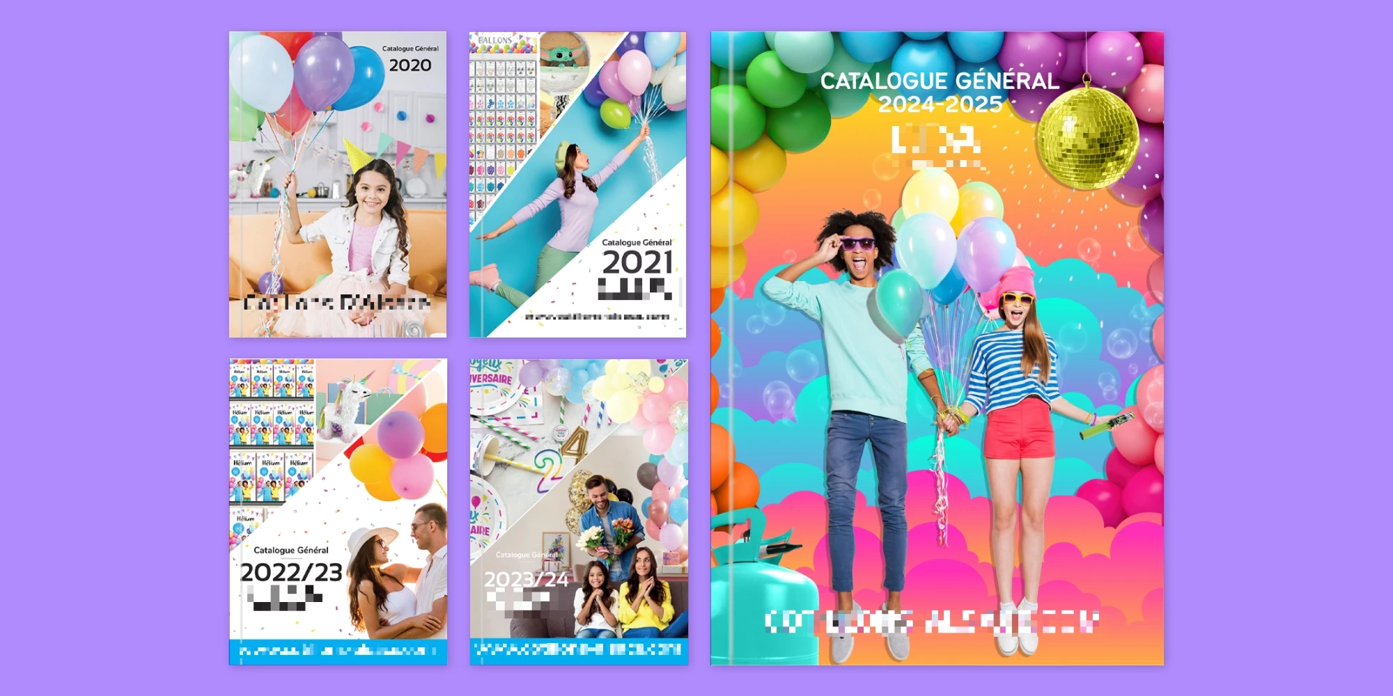
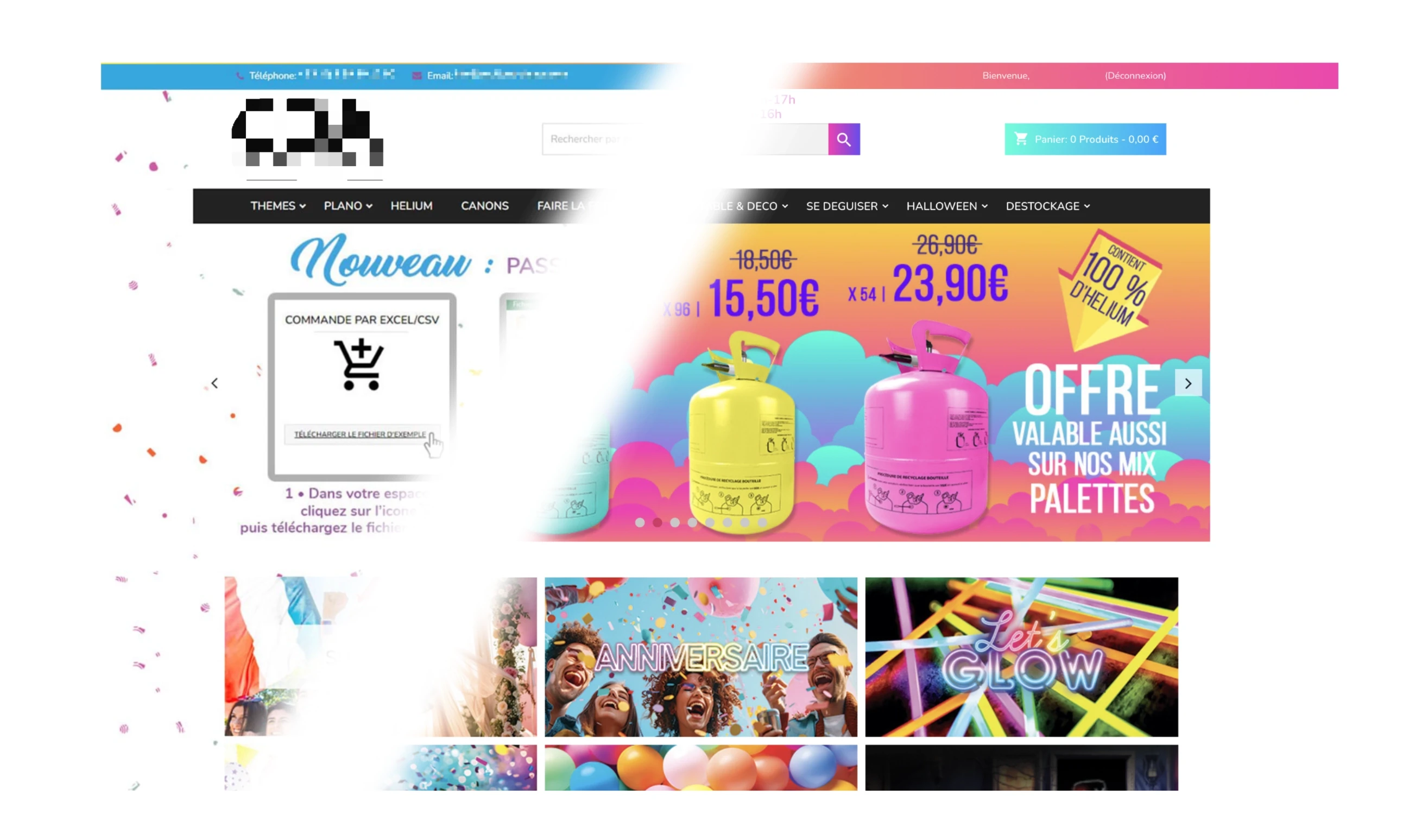
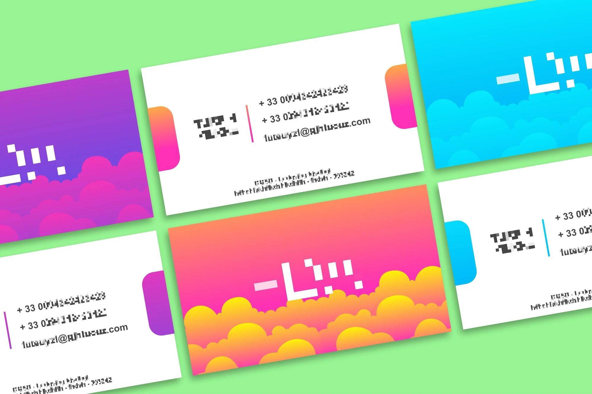
But this art direction sparked a wider evolution of the company’s identity, influencing everything from the website design to email & document's header designs, even business cards.