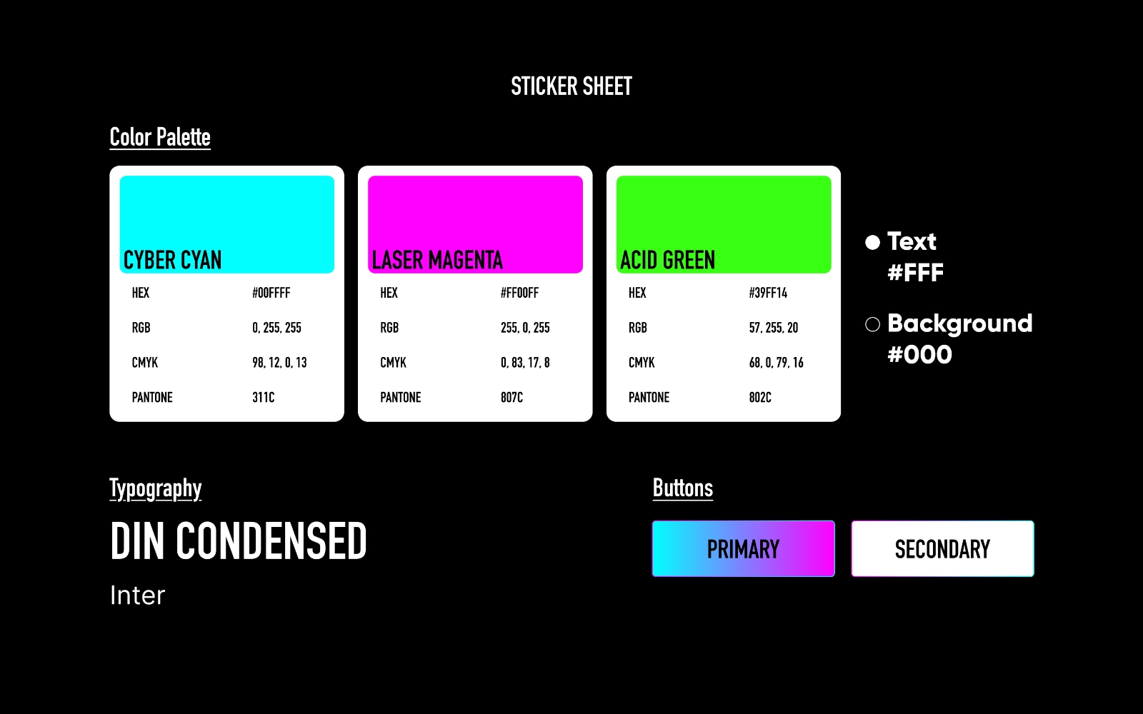
Visual Strategy
To reconcile the "Neon/Night" aesthetic with ecological imperatives, I designed a variable geometry identity based on the medium (Media-Adaptive Branding).
UI : Adoption of a default Dark Mode interface. On OLED & mobile screens, using black backgrounds reduces battery energy consumption and eye strain. Animations are minimal as well.
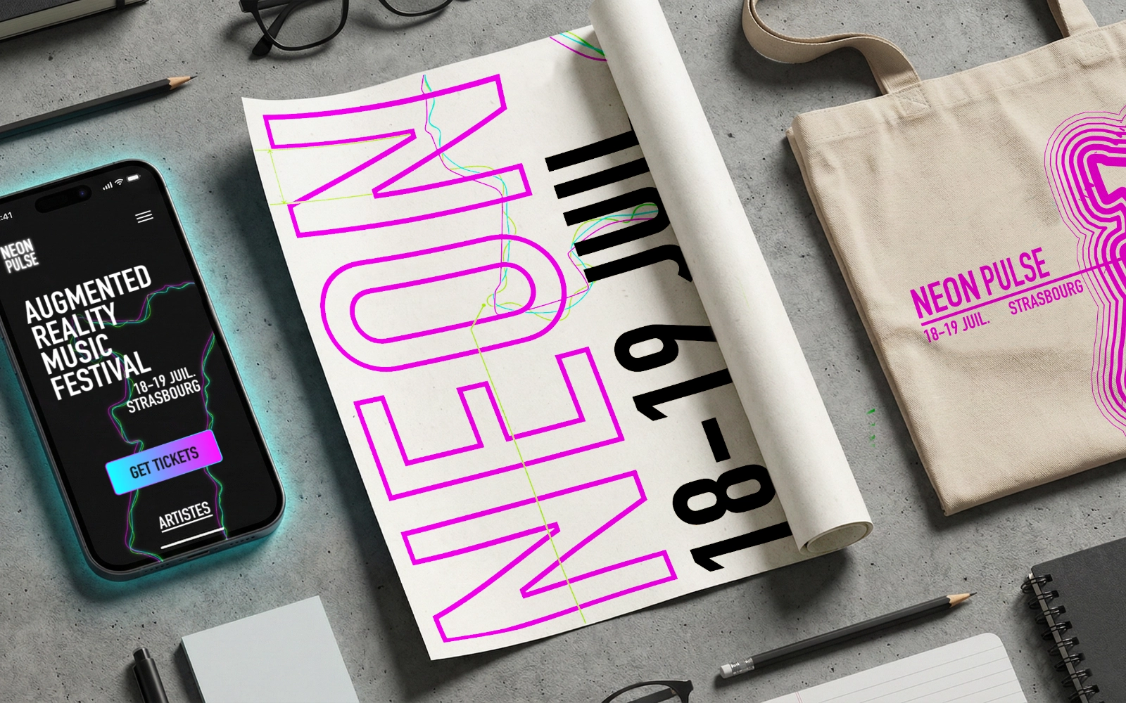
Print : For printing, the identity inverts. Instead of printing saturated black backgrounds (very ink-consuming), I opted for a layout on a white background revolving around negative space. The Neon then expresses itself through typography and wireframe shapes, reducing ink coverage to less than 15% on disposable media (flyers, programs).
Physical Deployment
To meet the needs of omnichannel marketing, I adapted the brand to tangible supports:
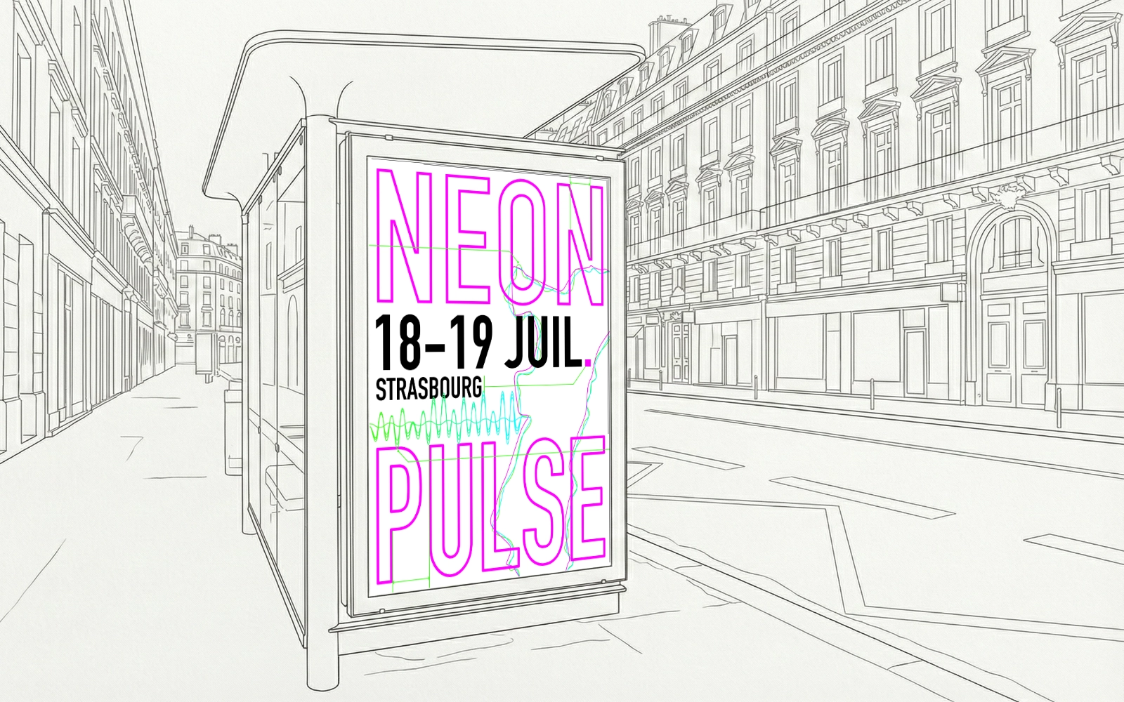
Urban Communication : Design of 4x3 posters and Bus Shelters with strict information hierarchy for fast reading. Complete mastery of the graphic chain and print files.
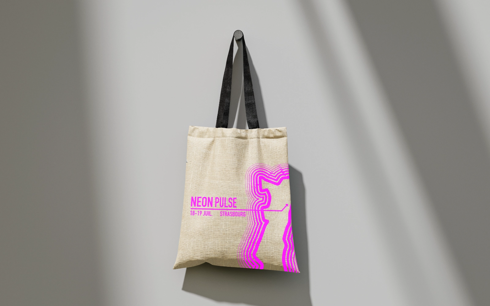
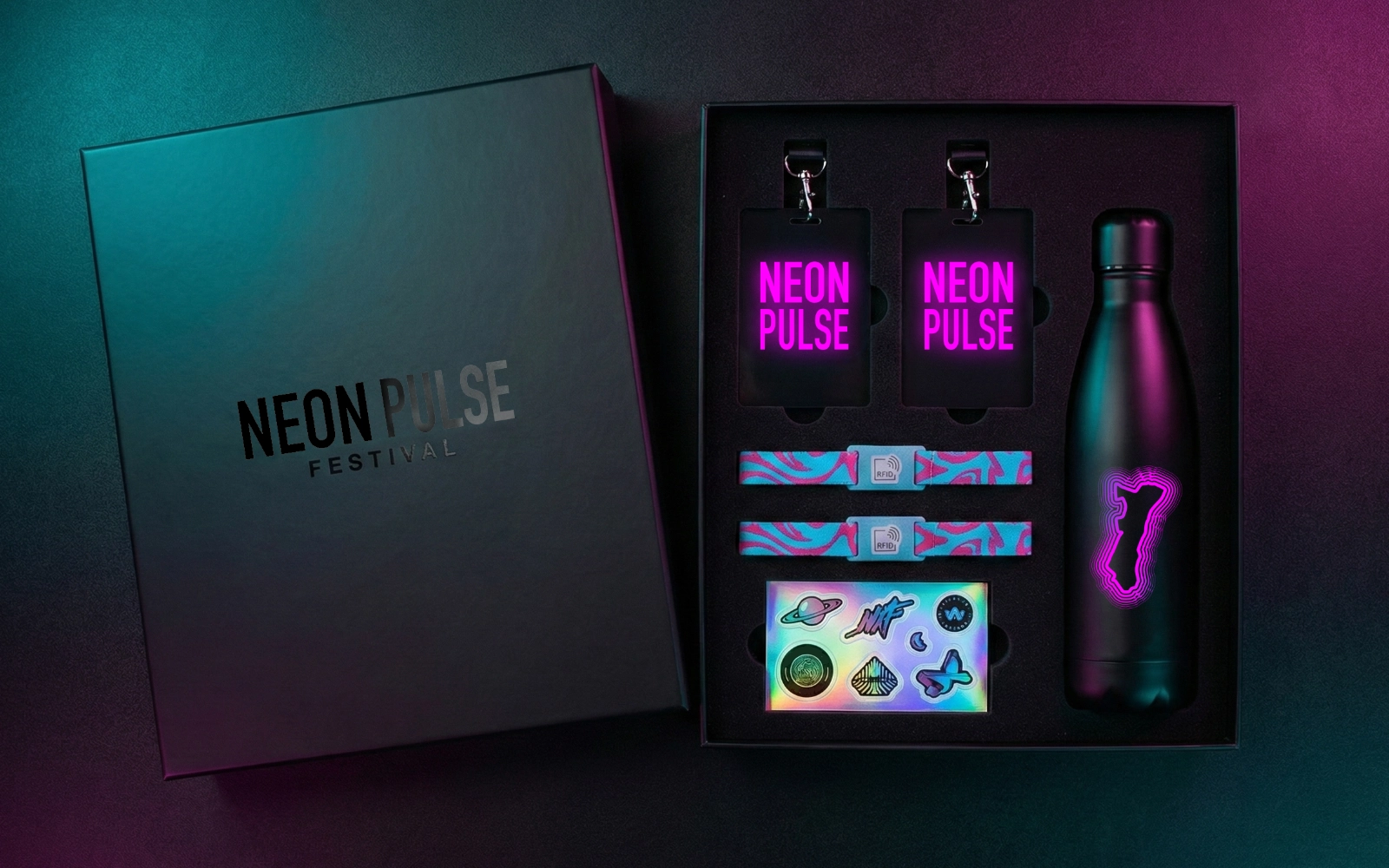
Apparel Collection : Creation of exclusive motifs and patterns for a capsule collection (T-shirts, Tote bags). Management of textile screen printing technical constraints.
Media Packaging: : Structural and graphic design of the Media Kit (Rigid box). Creation of die-cut files and adaptation to retail standards.
Acquisition
The digital aspect aimed for performance and community engagement.
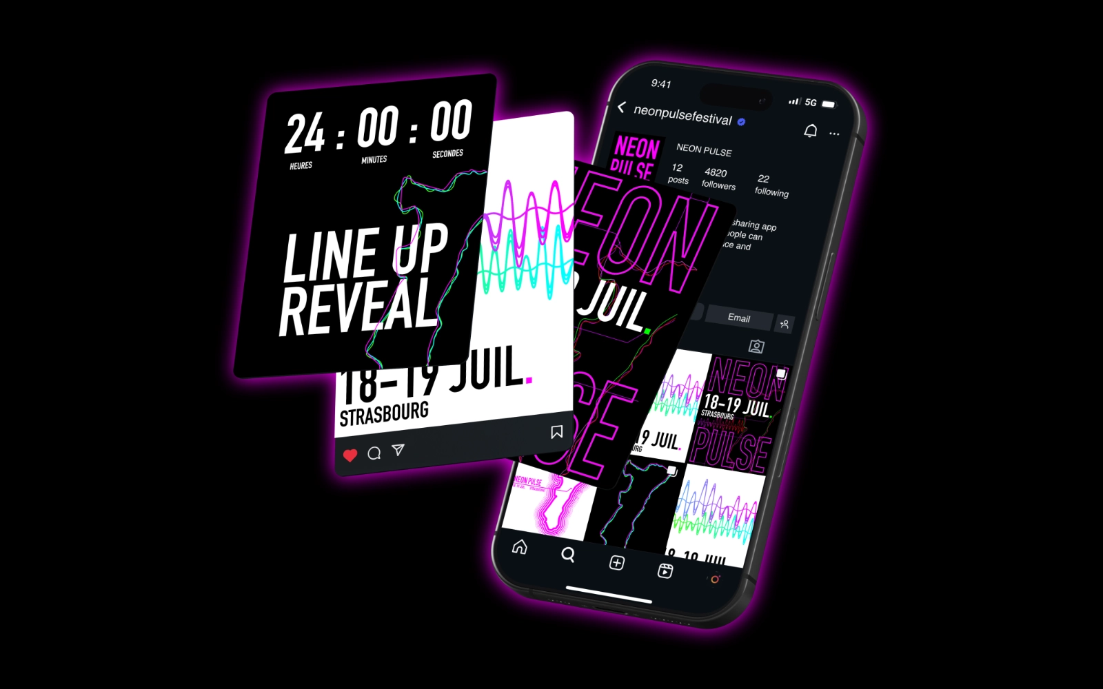
Web : Wireframing and design of the Ticketing Landing Page on Figma. Focus on mobile UX and conversion rate optimization.
Social Media : Production of visuals for Meta campaigns (Instagram/Facebook). Creation of carousels and impactful static formats to support the acquisition strategy.
Results & Competences
Versatility : Proven ability to manage a project from A to Z, from creative concept to delivery of technical files (Print & Web).
Technical Rigor : Simultaneous management of print constraints (CMYK, Pantone, Textile) and digital specifics (RGB, Weight, Accessibility).